UX Designers, It's Time to Rethink Your Approach to the Internet
Written on
Chapter 1: The Role of UX Designers in Online Experience
As a user, I'm reaching out to UX designers to reconsider the impact of their work on the internet. While I know many of you are professionals in the design field—especially on platforms like Medium—I want to emphasize that not all design choices are beneficial to users.
This morning, I opened my Outlook inbox and was surprised by an ad cleverly disguised as an unread email:

This ad appears at the top of my inbox, but it doesn't function like a regular email. For example, when I hover over the real Quartz email, I can easily delete it using the trash can icon or select it for batch actions. After years of using Outlook’s web interface, these actions have become second nature to me. The top UX team at Microsoft is aware of this.

When business leaders demanded a boost in conversions for the paid version of Outlook.com, they chose to disrupt my expectations with this misleading ad. Unlike standard emails, this one behaves differently, which can easily frustrate users.
As I hover over the ad, I notice how the interface changes:

The trash can moves to an unusual position—this is not typical for email management. A subtle indication that this is an advertisement, coupled with an ambiguous three-dot menu, adds to the confusion. The checkbox for selecting emails has been replaced with an Outlook logo that redirects me to a landing page instead of allowing me to manage my inbox. This process includes tracking mechanisms designed to measure the ad's effectiveness.
Using an understanding of user behavior to create deceptive interactions is not a good design practice. While it might yield short-term results, it ultimately leads to negative experiences and dissatisfaction.
It’s clear that many designers think deeply about these issues, as discussed frequently on Medium. However, I recognize that corporate pressures often push you towards these tactics. This approach is detrimental to the internet experience.
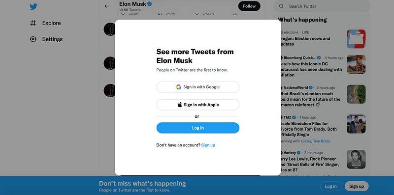
We can all sense that the online landscape is less enjoyable than it was 5, 10, or 15 years ago, despite the increasing number of UX and UI professionals. The contrast between modern Twitter and its alternative, Nitter—a simple, open-source version focused solely on tweets and timelines—highlights this decline.

Unlike Twitter, which bombards users with tracking scripts and ads, Nitter offers a streamlined experience that loads the requested feed without unnecessary distractions. Which platform truly provides a superior user experience? Without a doubt, it's Nitter.
The first video, 7 Things That RUIN Your Website's USER EXPERIENCE, delves into the common pitfalls that hinder user engagement and satisfaction.
The second video, We Answered The Internet's Toughest UX Design Questions..., tackles some of the most challenging issues faced by designers today.
In summary, it's crucial to abandon deceptive design patterns. While you may initially trick some users, they will eventually catch on, leading to long-term distrust, bloated products, and an overall decline in the quality of the internet. Let's work towards a better online experience for everyone.